Friday, July 31, 2009

Wabi-sabi 侘寂

A comprehensive Japanese aesthetic comprised of two concepts, wabi (rustic simplicity) and sabi (beauty that comes with age). When applied to man-made objects, wabi also refers to the imperfections arising from the process of construction, which are believed to add uniqueness and an understated elegance. Likewise, sabi can be found in the patina and wear of aged objects. Wabi-sabi nurtures beauty with authenticity by recognizing that imperfection, impermanence and incompletion are facts of life.

The influence of the wabi-sabi philosophy can be glimpsed in many areas of Japanese craft, culture and the arts. Let me focus on something I'm familiar with- fashion. I shall use the labels Commes des Garcons, designed by Rei Kawakubo, and Aski Kataski (a Japanese brand, despite its Greek name) as examples. Characteristic features of Kawakubo's work include assymetry, misplaced garment details and an 'unfinished' look, as if to emphasize the imperfect quality of the garments. I find this perspective highly refreshing and consistent with the wabi aesthetic.


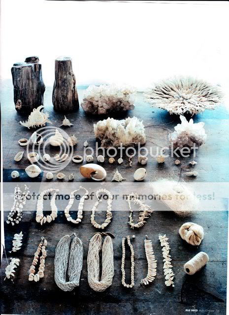
Aski Kataski clothes illustrate wabi in a slightly different manner. Made with raw-looking natural fabrics, they possess that rustic simplicity characteristic of wabi and, in addition, often come in shades suggestive of the patina that age brings (the sabi aspect). It is no surprise that deliberate rips, frayed hems and other forms of wear-and-tear usually induced by the passage of time are present in the garments as well. Each garment is unique and hence a work of art in itself.

In short, instead of striving to achieve a smooth polish like their Western counterparts, many Japanese designers embrace the anomalies of construction and the ageing process as design concepts, transforming that which is undesirable into something beautiful. I think the wabi-sabi philosophy deserves contemplation, as it helps us to appreciate the uniqueness of objects and to find beauty in imperfection. On a higher level, it may spur us to look beyond the material dimension of this world, for there is a Zen-like quality to wabi-sabi. What I find most illuminating is its emphasis on quietness. It reinforces the fact that things don't have to be loud to be worthy of attention, and that it is often the most simple and common things that escape our appreciation.
PS. 錆, the word for rust, is also pronounced as sabi. How apt, considering that sabi is associated with the natural process of aging.

Thursday, July 30, 2009

Japanese aesthetics

Picture source: Atlantis Home (top), TFS (bottom)

I've been reading about Japanese aesthetics out of interest. The values and concepts are deeply fascinating, and I can certainly see their influence on Japanese culture, art and fashion. Here are some prominent ones to begin with:
Yugen- 'barely glimpsed rich and mysterious beauty'
Furyu- 'refined manners, as reflected in things regarded as tasteful and elegant'
Sabi- 'a slightly bleak quality suggesting age, deterioration, and the passage of time'
Wabi- 'a cultivated aesthetic that finds beauty in simplicity and impoverished rusticity'
Mono no aware- 'a slightly sweet and sad quality as appreciated by an observer sensitive to the ephemeral nature of existence'; 'the pity of things'
--- 'Miyabi' on TFS
These concepts might seem foreign initially, but I think they resonate with all of us regardless of the culture or society we come from. I'll be going into detail on select ones in coming posts.
I studied Japanese for six years as a third language, hence all things Japanese occupy a special place in my heart. Studying another language from scratch was a very different experience from learning my mother tongue, which I did unconsciously from young. I think it allowed me to examine the nuances in meaning and structure of the language and to draw connections to Japanese culture and history. This was partly because of my matured perspective and developed analytical skills, and also because it was just so new to me. It's easier to digest something when it's fresh. Besides, my thirst for knowledge spurred me to seek any information that could help me in my understanding.
My sis and I desperately want to visit Japan after our college graduation, to immerse ourselves in the culture that so fascinates us and hone our (by then) rusty language skills. The last time when we were in Tokyo, we made a silent pact to return. Have you ever experienced what it's like in a foreign country, when a scene overwhelms you and you feel the strong pull of the place? I felt that in Japan on several occasions. Someday I must fulfill our pact.

Wednesday, July 29, 2009

Infinity

"If you accept that the universe is infinite, then that means there's an infinite amount of chances for things to happen... if there's an infinite amount of chances for something to happen, then eventually it will happen- no matter how small the likelihood.'
...

'Interesting,' she whispered. 'In these planets, everything that can happen will happen.'
...

I leaned over and kissed Francoise. She pulled away, or laughed, or shook her head, or closed her eyes and kissed me back.
...

Light-years above our bin-liner beds and the steady rush of the surf, all these things happened.

--- Extract from Alex Garland's The Beach

Tuesday, July 28, 2009

'Goth'- pen and watercolour


I like the stylized drips and spidery lines on this one. It has a gothic look with a feminine touch.

I was checking out the trailer of the upcoming Sherlock Holmes movie (I'm a closet fan of the stories). Don't think I know anyone in my circle who reads Sherlock Holmes though, except for my sis who loves it as much as I do. I must say, the movie seems to have a very different feel from the stories, though the costumes and sets are quite convincing. Much of it has to do with the casting, which I find surprising. Robert Downey Jr. as Holmes and Jude Law as Doctor Watson? Never would have thought of that. I'm unfamiliar with the former's acting, but my friend assures me that he's a brilliant actor. He better be, because I wouldn't want to lose Holmes' distinctive character and idiosyncracies to the adaptation process.

On another note, why is Irene Adler (played by Rachel McAdams) dressed like some kind of high-class hooker in the trailer? I envisioned her as a beautiful, elegant lady and not a seductive vixen. Hmm. I know Holmes is fascinated by her in one of the stories, but I really don't think he'd go so far as to have a romantic interest in her, considering his suspicion of and general aversion to women.

Seems like the movie plot isn't from the series, as I see some unfamiliar character names like 'Lord Blackwood' who I assume is the main villain. I guess the purpose of the reinvention is to appeal to a wider audience; to make it more 'Hollywood', if you will. A straightforward adaptation might be too staid, given the era in which the series was written. I'm sufficiently intrigued by the trailer to give it a go. At least I'd have something to look forward to at the end of this year. Good to know that the stories are still alive in some people's memories, and not just collecting dust on a shelf somewhere. A movie adaptation might very well generate interest in the series among the younger generation.

Monday, July 27, 2009

Prada F/W 09 Lookbook


I wasn't impressed by the Prada F/W 09 collection, but its recently-released lookbook has inspired me to view it in a different light. Existing runway and backstage images have been altered to produce a dark, brooding mood, an elemental theme and a slight surrealism that I love. It's a perfect synthesis of art, graphic design and fashion. The use of visual effects, including adding or subtracting elements, casting shadows and eliminating the distinction between the foreground and background, is rich in variety but not overdone. Some have that wry touch which reminds me of Surrealist painter Magritte's works. It's astounding how clothes can look so different when placed in another context.

Sunday, July 26, 2009

Letter from a Disgruntled HP Fan

Dear David Yates,

I'm not happy. I'm not happy at all. After making me and other Harry Potter fans wait an additional six months, this is what you give us? Plot changes without reason and the abbreviation of the climaxes of the book, the cave scene and the battle at Hogwarts. If you can still call it a battle, that is, seeing as all they did was kill Dumbledore (oops, spoiler), set Hagrid's house on fire and kick glass goblets off the long tables in the Great Hall (courtesy of Bellatrix). I felt so let-down and the word anti-climax is definitely appropriate here.

Ok, I accept that it's an adaptation which means rewrites are inevitable, and that the story has to be distilled to fit within a reasonable movie timeframe. Still, changes are only reasonable, only logical, if they better support the development of the movie compared to the original. What point did the Burrow attack serve? Everything just went by too quickly for any sort of impact to sink in. What point did overhauling the entire Harry-Ginny relationship serve, for that matter? It doesn't seem to add value to the plot. It was so ironic how their book kiss, which occured after a successful Quidditch match, became Ron and Lavender's kiss. It was as if the scriptwriter went, "Ho hum, I'm tired of everything so I think I'll just switch up their parts."

Remove that irritating waitress scene and the attack on the Burrow and there'll already be additional minutes of screen time which can be used to supplement other parts. Stop changing lines senselessly and giving one character's lines to another (Ron was practically mute in the last scene). Do that and I'd be a happier fan. Seriously, the next movie's got to be better, though I don't have high hopes.

All this sounds very pessimistic, but that's just me judging it critically. It's good if you counsider it in terms of entertainment value, and the acting was great, especially Rupert Grint's performance. Despite its flaws, it's still one of the better HP movies to me (the first two were too Christmas-y for my liking, if you know what I mean). Just that I'm not so rabid a fan as to rush out to catch it again.

Saturday, July 25, 2009

Blogger Products

The blogger who gave definition to the word 'streetstyle', the Sartorialist, has released a book compiling some of his shots as well as his thoughts on style. I'm planning to build my own collection of books and this seems like a great addition. Other titles I want to acquire? Under the Tuscan Sun (love its descriptions of rustic Italian cooking) and To Kill a Mockingbird, as well as a coffee-table book on modern Japanese houses.

Danny Roberts of Igor and Andre is probably the most famed illustrator in the fashion blogosphere and a great inspiration to me. His beautiful art is now emblazoned on a T-shirt and two Harajuku Lovers bags. How cute are they for school?

You know what? It'd be cool to have products featuring my own artwork. Just like it's my dream to produce my own line of clothes.

Friday, July 24, 2009

I was woken last night by the pattering of the rain, and lay listening to that reassuring sound for a while. I love rain- the sound of water drops splashing, the smell of a gathering storm, even the 'teethy' feel of it on my skin. I also like how everything seems clean after raining. It's something I'm gonna miss when I go abroad to study in slightly less than a month. I think what I'll miss the most is my twin sis. The longest period we've been separated for is one week, so I can't imagine going for one year without seeing her. I've accepted, though, that sometimes you've got to make sacrifices to attain certain goals.


I just finished reading The Beach by Alex Garland. Truth be told, I found the novel too disturbing, but that's just me. The concept is unique and well-developed, and overall it's a darkly fascinating, haunting piece of work and a searing commentary on human psychology. The mood is slightly thriller-like, as even moments of peace are tempered by a sense of lurking danger. I felt that the human dynamics illustrated were similiar to those in the TV series Lost. Maybe the writers of Lost were inspired by it?

The protagonist of the novel is a backpacker in Thailand named Richard, whose true adventure begins when a fellow hotel occupant commits suicide, leaving behind a mysterious map to a mythical 'beach' for him. The beach is claimed to be beautiful and pristine, untouched by human civilization. Given the increasingly crowded beaches of Thailand, that means a great deal to travellers seeking their own private paradise. With the map as their guide, Richard and a young French couple successfully reach the beach, and find a small community of people already living there. They assimilate themselves quite smoothly, and initially it does seem like paradise to them as they forget all about their previous lives. Gradually, though, a series of tragedies occur, and paradise starts turning into hell. The people there live in constant fear of having their secret beach exposed, a fear so strong that they can be savage towards potential threats. Eventually, the place becomes unbearable for Richard and his friends, and they finally manage to leave the beach.

I found it highly ironic that the beach, the supposed paradise they tried so hard to get to, is the one from which they have to escape. In some ways it's even more difficult and dangerous to leave the place than to find it. It just shows how perverse things become. I think it all starts with an innocent desire to possess one's secret space, something probably shared by many. I guess it's never that simple. Even when one wants his or her own private sanctuary, one is forced to share it with others. The secrets and insecurities of individuals, and tensions in human relationships prove to be the community's undoing. The most disturbing part was when they turned on one of their own, viciously attacking him for what they perceived as a betrayal.

I think I need to indulge in more light-hearted content now.

Thursday, July 23, 2009

Woodcut

This paper that I painted brown has an interesting texture- it feels slightly rough and reminds me of wood. I decided to go along with the woody feel by keeping the colours minimal. Really like how it turned out.

Feeling a little fatigued now from a sleepover at a friend's house. We stayed up late having a mini concert and watching Princess Mononoke. From there I heard some not-so-pleasant things about recent local university camps, like how students got so drunk that they puked everywhere and had to be fetched from the bar in the back of a lorry. Ugh. I just want to stay out of all the politics, drama, partying etc. in university and focus on my work.

Tuesday, July 21, 2009

Featured on Teen Vogue website

I was pleasantly surprised to see my photo pop up on the Teen Vogue website's Snapshot Blog. Thanks to the dear reader who alerted me. I sent it in for fun and didn't expect to be chosen at all. Fortunately, the comments so far have been very flattering. There's a slight mistake in the info, though- I'm 19, not 20. Just turned 19, in fact, as my birthday was on July 16.

Also, here are some illustrations in a slightly different style. I tried to draw the lines quickly to capture a sense of energy. I used a thin paintbrush dipped in black watercolour paint for the first, and a fine-tip black pen for the second.

There are still many works that I just did and want to share, including my favourite which is a woodcut-style illustration done on handpainted brown paper. Will try to get them up soon.

Monday, July 20, 2009

Mexican top

I really like the embroidery on this top. Here I've paired it with a gold heart necklace.


Close-up of the shoes which are actually men's from Cotton On (or at least, they were found in the male section). This was about the only size left, maybe because guys obviously have bigger feet than me.

With a different necklace, one that's made by my sis. It consists of white, silver and faux red coral beads strung on black cord. As you can tell from the photo, my hair's in an awkward growing-out phase. I'm thinking of cutting it like the one below (photo from Style Arena). A little hesitant because my haircuts rarely turn out the way I want them to. Maybe I just haven't found the right hairdresser yet.

Saturday, July 18, 2009

Common Totes

Common Totes is an online community where you can submit your designs for printing on a tote bag. Every month two designs are selected by public vote to be put into production. I like the concept for a few reasons:

1) There's prize money, obviously.
2) It's a platform for showcasing the design work of individuals like me.
3) It helps to promote the use of totes in place of plastic or paper bags. This is very important to me. I have a few cloth bags on hand for shopping purposes and I ensure that I carry one with me everytime I'm out.

I've submitted some designs which are adaptations of my fashion illustrations and I'd probably do a few more. It'd be great to receive some votes.

Thursday, July 16, 2009

Illustrated ads


I couldn't resist drawing these beautiful ads. Going out for Japanese food tonight because it's my birthday.

Wednesday, July 15, 2009

Exotic Locales


Experimenting with chalk pastels. Off to Art Friend to pick up some soft pastels as well as other supplies today (I wonder when my membership card expires?).

Tuesday, July 14, 2009

Illustrations


Recently I've started doing fashion illustration. I'm relishing the creative freedom I have now, not having to worry about schoolwork and grades. These two are examples of my early efforts (click to enlarge). Looking forward to growing as an artist and designer in college.

Monday, July 13, 2009

America

Eggleston Trust

In a little more than a month's time I'll be on a plane headed for Los Angeles. I'm not sure what to feel about it. Excited and relieved, I guess, and also scared. I can't explain why I'm doing this; I just feel like that's where I need to be right now. I always try to listen to my heart and not overanalyze things.
That being said, I need to plan the itinerary for a week-long trip as my mum's coming with me. We're probably going to get around using the Metro. Does anyone have any recommendations for where to visit (sights, shopping, dining, etc.)? Of course, I'd love places to do with art, fashion, architecture (for mum) and culture. We have pretty adventurous taste buds as well. I'm thinking of the Getty Center and Kate Spade and Coach stores for mum (apparently the bags are cheaper there than in Singapore). Any suggestions will be appreciated.

Saturday, July 11, 2009

The Belgian Avant-garde- Dries Van Noten and Ann Demeulemeester

The Western counterparts of Japanese avant-garde would have to be the Belgian designers, though the word 'avant-garde' and its connotations are somewhat of a cliche now. I think it simply means to offer a design perspective that differs from mainstream tastes and is hence refreshing. The Antwerp Six who graduated from Antwerp's Royal Academy of Fine Arts, of which DVN and Demeulemeester are the most prominent today, is a fine example. Those two happen to be among my favourite designers.

DVN's most outstanding works for me are the S/S 08, F/W 08 and S/S 09 collections. Each showcases a different side to the label. The S/S 08 collection is DVN's printmaking at its best. The use of bright, sumptuous colours and mixing of splashy floral prints create joyfulness and a tropical flavour. The unfussy cuts and drape of the garments bring out the full effect of the prints.

F/W 08, by contrast, shows a much darker and more decadent edge to DVN, both in the palette and treatment of materials. Its standout features include gold stitching, a glorious marbled print, knits intricately woven with many colours and necklaces made up of chunky bangles for a dramatic effect.

S/S 09 caught my eye with its clean lines and classy silhouettes. Bright colours like royal purple and tangerine and graphic checkerboard prints add contrast to the mainly monochrome palette. The hints of metallics in the 'bauble' necklaces and sequinned patches bring subtle glamour. All in all, a modern and polished collection that perfectly exemplifies DVN's easy elegance and his ability to make garments hang just right without appearing contrived.


Demeulemeester seems to be more consistent in her design aesthetic. The most interesting aspects of her work for me are the artsy, assymetrical cuts and juxtaposition of black and white. Her garments often have a raw, slightly savage quality but are curiously poetic at the same time. Her past two collections are great examples of classic Ann Demeulemeester.
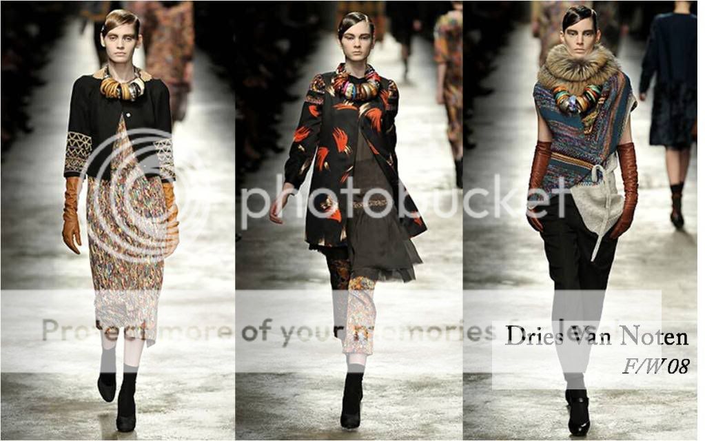
The monochrome palette lends the collections a slight graphic quality that highlights the interesting cuts of the garments. The controlled volume is also very appealing.
I feel that both Dries Van Noten and Ann Demeulemeester display restraint and a good eye for styling and editing that's lacking in some other designers. Their clothes are also perenially stylish as they are not concerned with being trendy. Viewing their past collections, I spot things that I still want to wear today. That's what I like about both of them.

Friday, July 10, 2009

Reckless Ericka on Not Just A Label

Singapore label Reckless Ericka, which debuted at the Blueprint show in this year's Audi Fashion Festival, has now been added to the designer directory of Not Just A Label. The web shop showcases the work of emerging designers and, like its name suggests, only a select number make it to its ranks. Great news for the designers of Reckless Ericka, who now have another avenue to sell their pieces.


Some of my favourite RE pieces (from their own website):

This draped top that can be worn in a multitude of ways (two pictured). Lately I'm fascinated with such multi-functional garments both because of their versatility and the ingenious cutting.


These two tops are actually unisex. I like the texture on the first and the print on the second.


A cool Union Jack-printed dress/tunic (left) and a floaty grey one gathered in the middle (right).

Something I've observed is that local designers lack adequate platforms for retail. The shop Blackmarket is one of the few, but it's located in Jalan Pisang, a pretty inaccessible place. I can't help thinking that online is perhaps the way to go- no concerns about high rental costs.

Thursday, July 9, 2009

Semi-abstract


I've posted some of Francis Bacon's figurative paintings before, but none of this type. I'm not sure how to classify them- they definitely contain representational elements, but are not realistic in the truest sense of the word so I'd settle for the term semi-abstract. I often struggle in describing works for art critiscism because I feel that I'm not paying full homage to the spirit of the piece. I think the paintings above are much about exploring composition and colour. When I think of Bacon, I always remember the combination of orange and pink (used in Dries Van Noten's Fall 09 collection) and the rosy hues of raw, dripping flesh.
I finished The Kite Runner or at least as much of it as I could bear to read. Some parts are too excruciating, not in terms of writing but the subject matter- violence, betrayal etc. I like to believe the best of human nature so when someone starts being horrible I turn the page. The idea espoused by The Kite Runner, that our lives are shaped by violent external forces as well as our own terrible impulses, strangely applies to Bacon's paintings as well. I get the same feeling for both- a sense of terrible beauty, repulsiveness, but at the same time a weird fascination and inability to look away.
My mum doesn't understand why people would want to create monsters. When I showed her Bacon's work, she exclaimed, "Why would anyone want to paint like that?!" To her, art is about rosy pictures where everything is serene and beautiful. She's confusing monsters with monstrosities. Sometimes I wonder where I inherited my taste and appreciation for things like art, literature and philosophy from. That my mum doesn't read novels at all and has never studied literature before is a wonder to me. Instead her bookshelves are filled with finance-related books and other technical stuff. It makes me feel a little lonely at times, when members of my family discuss the stock market at the dinner table. I must really seem like a wild child to them.

Multi-colour

I don't think I've seen hair colour as wacky and multi-dimensional as this one. It seems to take on different shades under the light- lavender, light green, grey etc. How intriguing. Not to mention the fact that it matches the print on her top.

Wednesday, July 8, 2009

An Early Christmas

I received my package today containing the two pieces I ordered from local site Schwing Schwing. I was so excited that I had to try them on immediately.

This white dress turned out a lot bigger than I expected- maybe I'm just petite? It's free size by the way. I like that I can wear it in loads of ways. Its potential shall be further explored.


This black vest/ top turned out GREAT. I think it looks better in person, like the white dress. It's very hard to explain what the cut is like, but the drape is nice and there's a pretty neat tab detail that you can pull out and fasten. I have absolutely no complaints to make about it and I really like it. If there's anyone who's planning to buy something from the site, I'd recommend this. In fact, I'm trying to refrain from getting more things for myself. The service was prompt and pleasant- I placed an order on Sunday night and after payment and everything I received my stuff on Wednesday morning. That's less than three days.
PS. The ankle boots I'm wearing are from Nine West in Abu Dhabi.

Givenchy HC 09

Have you ever experienced times when you wake up with a jolt in the morning, as if your body has been programmed to do so, then find that you are too darn excited to return to sleep? Well, this morning was exactly like that for me. Thoughts of the newly-released haute couture collections and the Half-Blood Prince UK premiere filled my mind and I had to get out of bed. One collection certainly didn't disappoint- Givenchy's:

Designer Riccardo Tisci's signature studs of varying shapes and sizes are applied in semi-intricate patterns. In a deviation from usual gold ones, red studs are used on some garments for a strong pop of colour (right). This hint of red in the collection is highlighted by the dramatic gradient effect on the bottom of a long white gown (centre).

The three bridal gowns in this collection are simply sublime. Their sweetness and romance are tempered by a slight tough edge introduced by the studded accessories. The chunky studded hair bands remind me of the thorned crown of Christ. Tisci's work fascinates me with its seamless blend of romantic and gothic elements. Nothing is ever too pretty.

Now for the stunning details (isn't that what couture is about?): The piles of bangles create a really striking effect. Couture is when one can go over the top without worrying about being too crazy. When truly genius couture is achieved, the audience is swept up by the strength and clarity of a vision and mentally transported elsewhere, even for a brief moment. With the creative freedom given, garments that are amazing works of art can be created. I'm saying all this only because:


You may know that Christian Lacroix recently filed for insolvency, and the label is in serious jeopardy. Recession blues, anyone? It's a miracle that he managed to put on a couture show at all. I'm not a big fan of his work but it still hurts me to think of the potential loss. Couture is creativity at the most sublime level, and the Lacroix label is a stellar example of that.