Saturday, June 6, 2009

Reckless Ericka


Singaporean label Reckless Ericka debuted its line in the Blueprint show at Audi Fashion Festival. 'Reckless Ericka' is a fictional character invented by the designers, which makes for a catchy, fun name. I think the logo is simple but effective as well. For its debut collection, the theme was 'Brit kid goes to India', which I take to mean interpreting all things British from an Eastern perspective. Hence you get elements like the Union Jack splashed on a dress, but not in an overtly obvious way. I like the styling and set of their lookbook, some photos of which you see here. It's just fanning my desire for Doc Martens- both the black and floral ones are rad. By the way, they offer great men's pieces as well and the clothes can now be bought at their website. Definitely a label to watch.

Friday, June 5, 2009

Geometry


The set is really cool, no? I think the bright blue boxes make for a really striking graphic effect. The rectangular frames contrast perfectly with the circles on my top.
I love wearing prints- stripes, checks, florals, graphic shapes etc. I'm still looking for the perfect checked shirt, though. I'm also loving my gold leaf necklace and cuff- vintage from my mum's jewellery box- and my perfectly simple gold sandals. Yup, I FINALLY found the right ones. People seem to like them as well and I can see why- the shape is classic and elegant, the metallic hue adds polish, and overall they are perfect for this unbearable heat that's been happening lately. It's so hot that I've taken to going sleeveless.

Tuesday, June 2, 2009

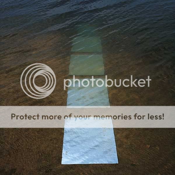
Into the Deep


The first image is a work of art by Francisco Infante-Arana & Nonna Gorunova who execute stunning outdoor sculptures and installations with mirrors. The way the mirrors catch the light and interact with the conditions of the environment is fascinating.

Monday, June 1, 2009

Ads and Editorials- Comme des Garcons, Marc Jacobs and Rodarte


I don't post much about ads and editorials but here are three that I like for their design and concept. I think one has to think about how to translate the key garments of the designer's collection for the season into arresting images to achieve a good ad campaign. Sometimes this means focusing on a certain special detail or feature of a garment eg. the beautifully-draped back of a Rodarte dress. The clothes will definitely be perceived differently from when they are on the runway as ads offer a static, two-dimensional presentation. There would be stronger brand identity and coherence if the theme of the collection is incorporated. In the second Rodarte ad, the slasher influence is hinted at with bold splashes and drops of blood-red ink that lend it a striking, modern graphic quality as well. Ads offer creative space and possibilities for stylists, photographers, graphic designers, typographers etc. to collaborate and achieve a beautiful and effective result.

Sunday, May 31, 2009

Artwork on my walls


That's right, I did another painting for my room wall. While I can appreciate a clean, minimalist, Zen-like aesthetic i.e. bare white walls, I'm really the sort of person who would want to fill the space with art. If I were a millionaire I'd be an art collector, filling my home with works that I love.

Saturday, May 30, 2009

Cards

Leaves, like seashells, are utterly fascinating in the variety of shapes they can take on. I did these leaf drawings with my thin-tip black pen and used them for cards.


These cards were whipped up for Jun's teachers. She provided the paper and I threw in the buttons (I've got quite a stash of them). I must say that the style is not what I'd usually do but I had fun.
You know what me and my sis spend on? Supplies. Art supplies for me, jewellery supplies for her, craft supplies for us both. It's possible to cut costs on jewellery and craft supplies (eg. buy at Salvation Army, Daiso) but with art supplies price is the indicator of quality.

Friday, May 29, 2009